Sunday, 19 May 2013

Evaluation


EVALUATION

Overall I am pleased with my finalised website and how it has followed my proposal. The website is bright, eye-catching and informative and includes  plenty of images to keep children interested. On top my original ideas, I have included further ideas not stated in my proposal. I am particularly pleased with my inclusion of a Quiz page, which was needed amongst the facts on my website. I also decided to add videos which I think are important as it gives my target audience another kind of visual stimulation. The World Map idea works well alongside Marshall McLuhan’s ideas as it explains the tight-nit interactive world we live in today.

The main problem I experienced in putting my website together is understanding the method of adding new pages to my website. I did a lot of Research into it and then once I had overcome that hurdle it seemed easy and I gained confidence in Web Design. As I got held up working with this part of web design it meant that I was left with less time to complete it. If I was to repeat my website I would have liked to spend more time getting to grips with CSS. CSS allows your website to have a better layout and everything I experimented with in CSS format had to be removed from my website as I preferred my original table. Another point that held me up was the compilation of facts for my website as I chose a broad topic so in the end I had to narrow it down and combine facts about the world amongst technological facts.

In relation to my target audience I believe my website works from the moment they click on my page. My design is simple but yet it is bold and colourful and they can relate to the homepage as they can relate it to Geography that they learn at school. I was anxious about how to break down the Global Village idea as it took me a while to understand Marshall McLuhan’s theories. I am really pleased with the Skype video I found as it tells them about how easily we interact with people on opposite sides of the world. Skype is the first technology I also thought of when discovering ‘The Global Village’ theory as it explains the way in which an event happening in one place in the world can be shown in another part of the world through interaction.

In relation to Marshall McLuhan’s ideas my website also fits with his when he says that through electronic media, ‘you can go on safari to kenya without going.’ My images and pictures allow the audience to have an overview of different continents and experience different sights all over the world. Also they learn how continents such as Africa are not as well advanced technologically as us. I decided not to fill the whole website with technological facts as I thought that this would be an overload of information and they wouldn’t remember them all. In this way their learning is varied.

My product description was achieved as I successfully made an educational website as intended. The only part I changed compared to my original proposal were the different pages that would be linked from my navigation bar. I originally wanted to provide a page on ‘The History of Technology’ and also a page on ‘Different Types of Technology.’ This changed as I thought that  the titles were boring and I wanted titles my target audience were more likely to click on. I labelled a page, ‘Who?’ as it made it a more attractive looking ‘click’ for my audience, so my idea for that page didn’t changed much as I still listed different types of technology and who and when they were invented. Then I thought about replacing my ‘History of Technology’ page with something my target audience of 10 to 15 year olds would remember, which was when The Quiz idea came around.

Having begun the Web Design module with very little prior knowledge I am extremely pleased with the final product I have created. The initial period of learning HTML was very stop and start. I would pick up how to add simple things to my HTML then, when I returned to it later on, have to teach myself all over again. Once I was left to my own devices and forced to learn it outside class without help I was encouraged to download a trial of Dreamweaver and try it myself at home. With help from W3school.com and the free tutorials I managed to complete my website.

Bibliography


Bibliography and References:

Books


Marah, John K. (1992) African people in the global village: an introduction to Pan African studies. Oxford: University Press of America.


Veltman, Laura. (2000) Living and Working in Australia: everything you need to know for building a new life ‘down under.’ Oxford: How To Books Ltd.


Inzelt, A and Hilto, J (1998)Technology Transfer: From Invention to Innovation. Kluwer The Netherlands: Academic Publishers.

Websites:


http://www.australia.com/about/culture-history/history.aspx


http://books.google.co.uk/books?id=A9-vCRaLhkgC&pg=PA45&dq=south+america+and+technology&hl=en&sa=X&ei=yUeTUaiaBobM0QWJu4GIAg&ved=0CDwQ6AEwAg#v=onepage&q=south%20america%20and%20technology&f=false


http://www.marshallmcluhan.com/biography


http://www.mapsofworld.com


http://www.worldatlas.com


http://www.slideshare.net/digitaljungle/australian-social-media-internet-facts


http://www.asianscientist.com/features/12-facts-asia-information-and-communication-technology-ict-2012/


Tutorials:


www.hyperlinkcode.com


www.w3schools.com

Saturday, 18 May 2013

Final Website


These our images of my final site, when taking snap shots of my site it is apparent how my layout could of been improved. The Homepage looks impressive but the pages are long and portrait, I wish they were better spread out horizontally.

The Homepage:


Marshall McLuhan page:


Global Village page:


Quiz page:


Who? Inventions page:


North America page:


South America page:


Europe page:


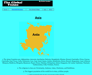
Asia page:


Australia page:


Africa page:


Friday, 17 May 2013

Where I got my links for my pictures on continents pages.

This is my links to my pictures I have used. I wanted to incorporate images of Countries in my website to relate to Georgraphy that they are currently learning. I want to break up my facts with pictures so my target audience are more enthusiastic about learning facts on the world. I also hope my adding pictures of Countries it will give them a better insight into the Global Village theory and what Marshall McLuhan is saying on the world and the impact of electronic media. The colour and contrast has also been edited in them to make them bold and bright to fit in with my website.

South America

1. Santo De Angel

(http://d30mmglg94tqnw.cloudfront.net/wp-content/plugins/magic-gallery/uploads/14/Salto%20Angel_2.jpg)

2. Amazon Rain Forest

(http://www.destination360.com/south-america/brazil/images/st/brazil-amazon.jpg)

3. Chimborazo and Cotopaxi


(https://blogger.googleusercontent.com/img/b/R29vZ2xl/AVvXsEiZ35J_rOL9beus6ReuVmafqKF_TTw18Tn6mPUJ_mUfgU6DC52IAbUfN7nvLlSq4-u6GdvW1y1L5-7AkZxvABBSDEOcbv7SJBnTuoSdKf3jb3QjjkSBMEIGmCpo_JXoFipgsayhyzXnSGM/s1600/Chimborazo.jpg)

4. Cotopaxi
(http://www.kijkeensomlaag.nl/cms/images/stories/Cotopaxi_-_Andes_Equador.jpg)

5. Brazil

(http://i.telegraph.co.uk/multimedia/archive/01708/brazil_1708709c.jpg)

                                          North America

1. Mississippi

(http://pubs.usgs.gov/fs/2004/3121/images/river.jpg)

2. Steamships

(http://upload.wikimedia.org/wikipedia/commons/2/27/Canada_Steamship_Lines_passenger_steamboat_KINGSTON_at_the_wharves_in_Toronto_harbour.jpg)

3. Lake Superior

(http://wallpaperswiki.org/wallpapers/2012/10/Lake-Superior-1080x1920.jpg)


Africa

1. slaves

(https://blogger.googleusercontent.com/img/b/R29vZ2xl/AVvXsEjHdmmlwesWpccN7bA9yQszhUC5MALSaSOBT1M56IUsv0rjJ9Iq-exGsOEEX_54wWNLsAGxEISq8qO6538dnjhJ6nJKD6XSGNjbwL8HoKmU0XUqqrIMAn2z7NJLv9xyhesK3fFLkBd6P4xY/s1600/African+children+on+Slave+Ship.jpg)

2. house

(http://www.luxlife.co.za/blog/luxury-real-estate/super-rich-buying-properties-again-in-south-africa)

3. mud hut 

(my own photography)


Asia

1. Mount Everest

(http://static.guim.co.uk/sys-images/Guardian/About/General/2010/4/9/1270830860464/Mount-Everest-001.jpg)

                                             Australia


1. Technology park

(http://www.techpark.sa.gov.au/content/images/featured_content_img.jpg)

2. Australia

(http://www.livefortheoutdoors.com/upload/533178/images/Australia,_Sydney_-_Opera_House.jpg)

                                                Europe


1. Vatican City

(http://techmoran.com/wp-content/uploads/2013/03/vatican-city-from-the-air.jpg)

2. Germany

(http://0.tqn.com/d/gogermany/1/0/p/6/-/-/rhine.jpg)

Thursday, 16 May 2013

Videos


Skype Video

This video best explains the Global Village as Skype allows people across the world to connect. This video also is told in a story mode which would relate best to young people. It includes reference to other technologies such as mobile phones and fax machines.

(http://www.youtube.com/watch?v=m1mflr-kQlk)

Marshall McLuhan

The Marshall McLuhan video  is also going to included on my website  . I do not expect my audience to want to watch all 8 minutes of it but hopefully a few minutes of it will allow them to take something away from it. The video also was filmed in  1960 so it gives an example of how technology has changed . Parents and Teachers also might view my website so they will be able to  understand the motivation behind my website.


(http://www.youtube.com/watch?v=HeDnPP6ntic)

CSS

Cascading Style Sheets

-controls the presentation of content
-creates uniformity
-makes it easier

Internal or External Style Sheets
1. Parameters or using Internal v External style sheets
2. Syntax- what are the differences?
3. How to link the external style sheet

Create a Navigation Menua
1. Decide on colours and typeface


Saturday, 11 May 2013

Who? Page

The previous idea was to do a page on 'Different Types of Technology Page' but instead this page will now be labelled 'Who?' This will include inventions and who made them and the year, such as mobile phones and televisions. I decided on doing this as when Researching Continents, I came across these facts so have decided to do a separate page on Inventors. The page will be titled, 'Who?' as I don't want to put a long title as I want my audience to click on it.

Who? Page Images

Radio
Information: (http://inventors.about.com/od/rstartinventions/a/radio.htm?rd=1)


(https://upload.wikimedia.org/wikipedia/en/thumb/d/de/Tesla_aged_36.jpeg/220px-Tesla_aged_36.jpeg)


(http://upload.wikimedia.org/wikipedia/commons/thumb/0/0d/Guglielmo_Marconi.jpg/220px-Guglielmo_Marconi.jpg)

Television
Information:
(http://inventors.about.com/library/inventors/blfarnsworth.htm)
(http://www.funfotos.com/charlesfrancisjenkins.html)
(http://www.bairdtelevision.com/jenkins.html)


(http://iranianschool-be.com/specials/uploads/article/large/philo.jpg)


(http://i.dailymail.co.uk/i/pix/2013/01/10/article-2259923-16D76677000005DC-757_306x423.jpg)

Laptops and Computers
Information:
(http://www.independent.co.uk/news/obituaries/bill-moggridge-computer-pioneer-behind-the-first-laptop-8125973.html)


(http://static.dezeen.com/uploads/2010/11/Dezeen_Bill_Moggridge.jpg)

World Wide Web
Information:
(http://www.dailymail.co.uk/sciencetech/article-2317212/First-web-page-built-Tim-Berners-Lee-goes-live--looks-like-Google.html)


(http://24.media.tumblr.com/tumblr_lycejnya9w1qz6mrqo1_500.jpg)

Mobile Phones

Information:
(http://news.bbc.co.uk/1/hi/8639590.stm)


(http://www.wired.com/images/article/full/2008/05/martin_cooper_500px.jpg)

Monday, 6 May 2013

Quiz Page

Instead of having 'The History of Technology' page in place I will have a quiz page which will test my target audience on my website facts. From looking at other educational websites, a 'Quiz' page is important as it encourages children to pay more attention and they will find it rewarding.

Image included on my 'Quiz' page:

(http://sueatkinsparentingcoach.com/wp-content/uploads/2011/07/Traffic-Lights.gif)

I have used the website: http://www.quizbox.com/ to design my quiz.
The  Quiz will be multiple choice incase some of the questions are too hard. It is hard writing for a target audience of 10 to 15 year olds.

Saturday, 4 May 2013

Title: The Global Vision

What the website is lacking so far is a title header for the website. 

The chosen title is:
The Global Vision

Global= in relation to the Global Village to put that into my website title.

Vision= the whole point of the website is for my target audience to see where each part of the world currently stands.

To make the website header I have used Photoshop. The font was chosen firstly and then given a black background. As my website is colourful I wanted something bold and simple so it wouldn't clash.


Making the banner the right size was an obstacle as I didn't want it to be bigger than my navigation bar. 


My name has also been incorporated into the header as it needed something in the spare space of the title.