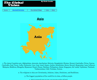
These our images of my final site, when taking snap shots of my site it is apparent how my layout could of been improved. The Homepage looks impressive but the pages are long and portrait, I wish they were better spread out horizontally.
The Homepage:
Marshall McLuhan page:
Global Village page:
Quiz page:
Who? Inventions page:
North America page:
South America page:
Europe page:
Asia page:
Australia page:
Africa page:


No comments:
Post a Comment